
I still remember the first time I heard the word mockup. It was during a meeting with a client who asked, “Can I see a mockup of the homepage?” I nodded confidently… then immediately Googled what a mockup was. 🙈
That moment changed everything. Since then, mockups have become one of my favorite tools — not just for impressing clients, but for refining my own creative process. In this post, I’ll walk you through what mockups are, how they’ve helped me in real projects, and how you can start using them today to bring your ideas to life with clarity and confidence.
What exactly is a mockup?
Let’s keep it simple: a mockup is a high-fidelity, static visual representation of your design. It’s not clickable like a prototype, but it shows what your final product — be it a website, an app screen, or a product label — will look like when it’s done.
Here’s where it gets interesting: a good mockup doesn’t just show what something looks like, it shows how it feels in context.
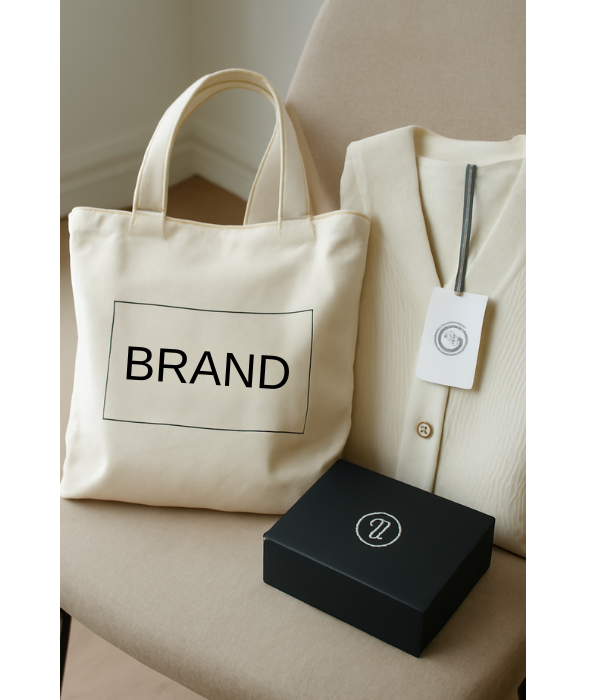
For example, when I was designing a wellness brand for a client last year, I presented her logo not just on a white screen, but on a linen tote bag and an amber glass bottle. She lit up. That visual made it real.
Where mockups shine in your creative workflow
I used to go straight from sketch to final design, skipping the mockup step. Big mistake. When I finally started using mockups consistently, I noticed four powerful benefits:
- They tell your story better. Whether you’re presenting to a client or posting on Instagram, a mockup helps your audience understand your vision instantly.
- They save you from costly mistakes. I once mocked up a business card design and realized the font was way too small — imagine if I’d printed 500 of them?
- They invite feedback early. With mockups, it’s easier to gather reactions and pivot before you’re too far along.
- They market your work for you. I’ve had clients choose me just because they saw my work looking polished inside beautiful mockup scenes.
Different types of mockups (and when I use each)
Here are the main categories I use regularly:
- UI/UX Mockups: Great for showing websites or apps. I use them when I want to present a homepage in a browser frame or a mobile app on an iPhone.
- Product Mockups: Essential for e-commerce and packaging. I’ve mocked up everything from T-shirts to essential oil bottles.
- Print Mockups: I always check how my designs will look on flyers, cards, or notebooks before sending them to print.
- 3D Mockups: These are amazing for more realistic presentations. Tools like Artboard Studio or Photoshop with smart layers work wonders here.
Wireframe, mockup, prototype… what’s the difference?
This confused me for a long time too. Here’s how I like to explain it:
- Wireframe = the bones. It’s like a rough sketch showing layout and structure.
- Mockup = the skin. You add real colors, fonts, and imagery — but nothing’s clickable yet.
- Prototype = the movement. This version lets users interact with buttons and flows.
Think of it like planning a house:
- Blueprint = wireframe
- Interior design board = mockup
- Virtual walk-through = prototype
Tools I’ve used (and recommend)
Depending on your level of design experience, here are some great tools — all of which I’ve tested:
For beginners:
- Canva: Ideal for social media and branding mockups. I started here!
- Placeit: Great for placing your design on mugs, T-shirts, and tech screens.
For intermediate designers:
- Figma: Clean interface, especially good for UI/UX. The “Mockup” and “Angle” plugins are lifesavers.
- Artboard Studio: Browser-based, drag-and-drop, and lets you animate mockups.
For pros (or perfectionists):
- Adobe Photoshop: With Smart Objects, you just double-click, paste your design, and voilà.
- Sketch: Especially if you’re on Mac — it’s powerful and fast for interface design.
Some websites I swear by for free and paid mockup templates:
- Freepik
- MockupWorld
- GraphicBurger
- UI8
How I use mockups in real projects
Let me walk you through a quick workflow I’ve used more times than I can count:
- Design the asset. Maybe it’s a new logo, app screen, or product label.
- Find a mockup template. I look for one that matches the context (e.g., coffee shop scene for a café logo).
- Insert the design. I drop my file into the Smart Object or placeholder.
- Refine details. I adjust shadows, reflections, and background colors.
- Export and send. I include it in client presentations, portfolios, or social posts.
I even used a mockup once to help a bakery client visualize her storefront before it was painted. She was in tears (the happy kind 💛).
Best real-life use cases
Some practical ways I’ve personally used mockups:
- Client proposals: Instead of just sending a logo, I place it on tote bags or signage. It elevates the pitch.
- Portfolio website: Mockups make your work pop. They show how your design functions in the real world.
- Instagram posts: Instead of flat images, I show the design on phone screens or in lifestyle scenes — it boosts engagement.
- Investor decks: When pitching a new app, I show clickable-looking screens inside phone mockups. Instant credibility.
Tips I’ve learned (the hard way)
Here are some golden rules I follow after some trial and error:
- Always use high-resolution templates. A blurry mockup can ruin an otherwise amazing design.
- Match the vibe. If the design is elegant, use a minimal and clean scene. Don’t put a luxury logo on a grungy hoodie mockup.
- Add realism. Shadows, reflections, and subtle textures make a big difference.
- Don’t overdo it. One or two mockups per item is enough. You’re showcasing the design, not the template.
What to avoid
Let me save you some headaches with these common missteps:
- Skipping mockups entirely. Even a simple one makes a big impact.
- Using clashing styles. A polished logo in a chaotic background confuses the viewer.
- Ignoring commercial licenses. I once used a mockup I thought was free and got a takedown notice. Lesson learned!
- Overloading with effects. Keep it simple — don’t let the mockup overpower the actual design.
Final thoughts from someone who learned by doing
Mockups aren’t just for agencies or pro designers. They’re for anyone who wants their creative work to be understood, appreciated, and taken seriously.
Since I started using mockups, I’ve noticed clients trust me more, my social posts get more attention, and I feel more confident about my own work.
If you’re still not using mockups, give it a try on your next project — even if it’s just for fun. It might surprise you how much of a difference it makes.
And hey — if I could figure this out, starting with zero experience, so can you.
From zero to design hero — keep creating!
by Cris.