
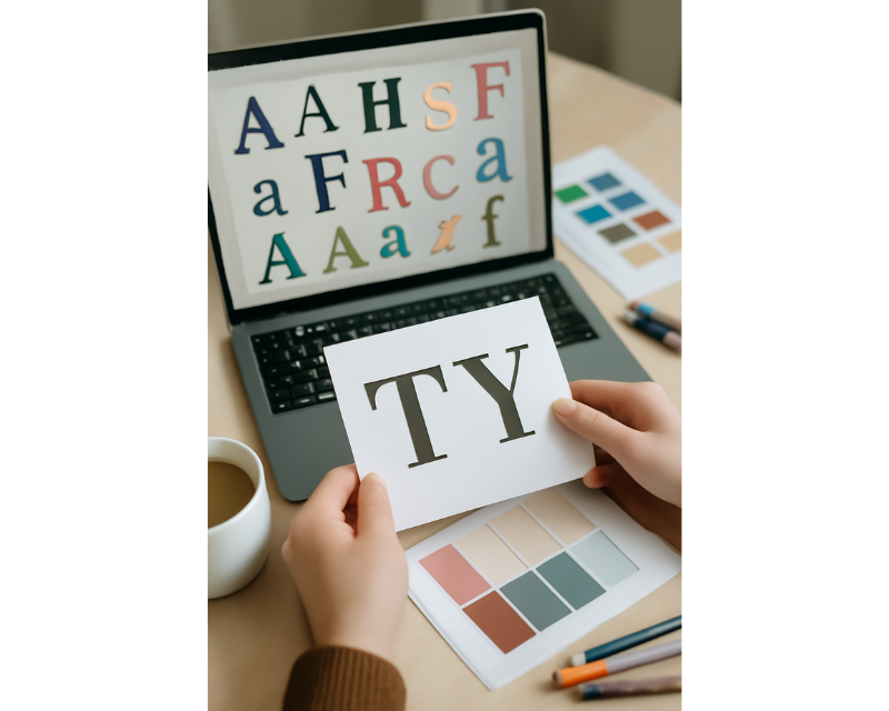
Typography is one of those things I didn’t fully appreciate until I started working on more serious design projects. At first, it felt like an afterthought—just picking a font that looked good. But over time, I realized that typography is so much more than that. It’s about communication, readability, and creating a connection with your audience. If you’re just starting out, understanding typography is crucial for your growth as a designer, and it will make your designs look more professional and impactful.
🔹 Why Typography Matters in Design
Typography plays a critical role in how your design is perceived. It’s not just about making the text legible (though that’s important), but about setting the tone, creating visual hierarchy, and guiding the viewer’s eye. As a beginner, I found it helpful to understand that typography is all about enhancing the message of your design and making it more engaging for your audience.
For example, consider this:
- Red can evoke excitement, passion, or urgency.
- Blue is associated with calmness, trust, and professionalism.
- Yellow can bring energy, happiness, and attention.
By using typography strategically, you can set the right mood for your design and make it more effective in communicating your message.
🔸 Understanding Fonts: The Basics
Before diving deep into typography, I had to learn about the different types of fonts and how to use them effectively. Fonts are categorized into several groups, each with its own personality and use. Here are the main categories:
- Serif Fonts: These fonts have small lines or “serifs” at the end of each letter. They have a more classic and formal feel. I often use them for print designs or more traditional projects (think Times New Roman or Garamond).
- Sans-Serif Fonts: These fonts are cleaner and more modern because they lack the “serifs.” They work great for digital designs and are often used for websites or apps (Helvetica and Arial are the go-to examples).
- Display Fonts: These fonts are used for making a statement, often in headlines or logos. They can add personality to your designs (think of fonts like Impact or Lobster).
- Script Fonts: Mimicking handwriting or calligraphy, these fonts bring an elegant or personal touch. I love using them for wedding invitations or more artistic projects (fonts like Pacifico or Brush Script).
Knowing which font category to use for each project can help you make better design choices, and trust me, it makes a huge difference.
🔹 The Anatomy of a Typeface
As a beginner, I didn’t pay much attention to the anatomy of fonts, but understanding it has been a game changer for me. Every typeface has unique features, and learning these terms helped me choose the best font for my designs.
Here are some key terms to know:
- Hairs and Strokes: These are the thick and thin lines that form the characters.
- Ascenders: These are the parts of lowercase letters (like “b” or “d”) that rise above the height of lowercase letters like “x.”
- Descenders: These are the parts of lowercase letters (like “p” or “g”) that drop below the baseline.
- X-height: This refers to the height of lowercase letters, specifically those like “x” or “v.”
Learning the anatomy of a typeface gave me a better understanding of how each font is constructed, making it easier to evaluate which font would work best for my designs.
🔸 Choosing the Right Font for Your Design
When I first started, I didn’t always know how to choose the right font. Now, I’ve learned that font choice should align with the purpose of the design and the message you want to convey.
Here’s what I think about when choosing a font:
- Tone and Mood: What is the tone of your project? If it’s a formal presentation, a serif font might work better. For something more casual or playful, sans-serif fonts are often a better choice.
- Audience: Who are you designing for? Think about their preferences, and consider fonts that will resonate with them.
- Readability: Some fonts are beautiful, but they can be hard to read. I’ve learned that readability should always come first, especially when it comes to body text.
By experimenting with different fonts, I’ve learned to pick the right one for every project, and that has improved my designs significantly.
🔹 Hierarchy and Readability
Typography is essential for creating visual hierarchy in a design. I used to think that hierarchy was all about the content itself, but once I started using typography to establish hierarchy, my designs became much clearer and more effective.
Here’s how I create hierarchy with typography:
- Size: Larger fonts attract attention. I make sure to use bigger fonts for headings and titles, and smaller fonts for body text.
- Weight: Bold fonts emphasize key elements, while lighter fonts work for less important content.
- Color and Contrast: Contrast is crucial for making important text stand out. I use contrasting colors to highlight titles or key information.
By establishing a clear hierarchy, I guide the viewer’s eye through the design, ensuring they focus on the most important elements first.
🔸 Font Pairing: Mixing Fonts Like a Pro
One of the trickiest parts of typography for me as a beginner was learning how to pair fonts. I used to think I could throw a bunch of different fonts together, but it often looked chaotic. Now, I know that pairing fonts is about finding balance and contrast.
Here’s how I pair fonts:
- Different Categories: I pair fonts from different categories (like serif with sans-serif) to create contrast.
- Limit the Number of Fonts: I usually stick to two or three fonts in a design to keep it cohesive.
- Use Variations: I can create variety by using different weights or styles (regular, bold, italic) within the same font family.
The key to successful font pairing is balance. By experimenting with combinations, I’ve found that the right pairing can add personality to my designs without making them feel cluttered.
🔸 Leading, Kerning, and Tracking: Getting the Spacing Right
I can’t tell you how much spacing can make or break a design. Proper spacing between letters, lines, and words is essential for readability and aesthetics.
Here’s what I focus on:
- Leading: The space between lines of text. I adjust the leading to make the text more readable, especially for long paragraphs.
- Kerning: The space between individual letters. I make sure that the letters are evenly spaced and don’t feel too tight or too loose.
- Tracking: The space between a group of letters. Tracking affects the overall density of the text and can make your design feel more balanced.
Good spacing is essential for creating designs that are easy to read and visually appealing.
🔷 Conclusion
Typography is a crucial part of any design. By understanding the basics, from font selection to spacing and hierarchy, you’ll be well on your way to creating designs that are not only visually appealing but also effective in communicating your message.
I’ve learned that typography isn’t just about picking pretty fonts—it’s about using type to enhance the meaning of your design. So take the time to experiment, learn, and apply these principles, and soon you’ll be using typography like a pro in all your projects.
From zero to design hero — keep creating!
By Cris