
Starting out in design can be overwhelming. I remember when I was just getting into it, feeling unsure and making plenty of mistakes. The beauty of design, however, is that each mistake is a chance to grow and improve. If you’re just starting your design journey, knowing the common mistakes can save you a lot of time and frustration. Let me share some of the most common mistakes I made early on, and how you can avoid them to become a better designer faster.
🔹 Ignoring the Importance of a Strong Foundation
One of the biggest mistakes I made as a beginner was not focusing enough on the fundamentals. Sure, I was excited to learn design tools and software, but I didn’t spend enough time understanding the basic principles of design. These principles—like alignment, contrast, hierarchy, balance, and typography—are what truly make a design work. Without them, even the best tools won’t help you create great work.
To avoid this mistake, focus on learning the fundamentals. I recommend starting with simple projects, like basic layouts or logos, to apply these principles. You can also ask more experienced designers for feedback, which was super helpful for me. By mastering these basics, you’ll create more polished and professional designs.
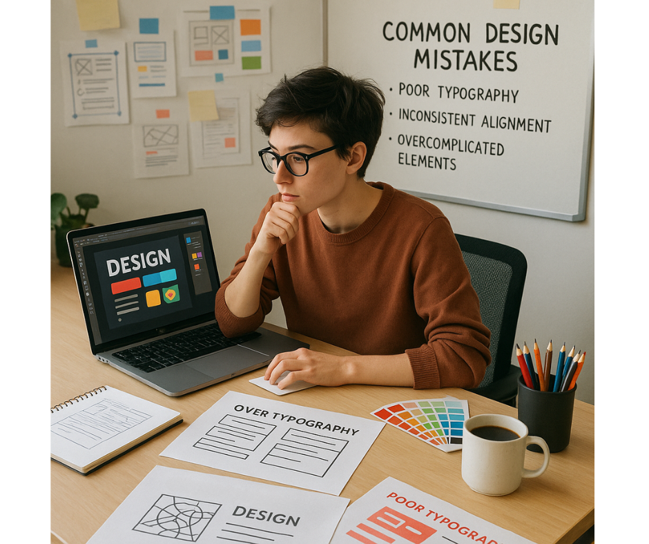
🔸 Overcomplicating Designs
Early in my career, I was guilty of adding too many elements, colors, and fonts to my designs. I thought the more I included, the better the design would be. But in reality, simplicity is key. Overcomplicating a design can make it feel cluttered and take away from its core message.
How to avoid this? Keep things simple. Start by using only the necessary elements and focus on clean, minimal designs. I also learned to embrace white space, which creates breathing room and highlights the important parts of a design. Limit your color palette to a few harmonious colors and use no more than two or three fonts. This approach has made my designs more impactful and easier to navigate.
🔹 Not Understanding the Target Audience
It’s easy to get caught up in what you think looks good, but I quickly realized that design isn’t just about personal taste—it’s about communicating effectively with your audience. As a beginner, I sometimes designed based on my preferences rather than considering what the audience needed. This created a disconnect between the design and its purpose.
To avoid this mistake, always conduct research about your target audience. Think about their preferences, needs, and behaviors. Design with empathy. For example, a design targeting young adults might use a bold, modern font, while a corporate design might call for something more traditional. By focusing on your audience, you’ll create designs that are not only aesthetically pleasing but also functional and relevant.
🔸 Not Using Consistent Visual Elements
One of the most common mistakes I made early on was inconsistency. I would use different fonts, colors, and layouts in the same project, thinking it would make the design more interesting. But instead, it made the design feel disjointed and unprofessional.
To avoid this, I created a style guide. I set a consistent color palette, used the same fonts throughout, and stuck to one layout style. I also made sure that the spacing between elements was uniform. Consistency brings unity and helps guide the viewer’s eye through your design, making it more organized and professional.
🔹 Neglecting Mobile and Web Compatibility
As more designs are created for websites and mobile devices, it’s essential to make sure your work looks good across all platforms. I didn’t always consider how my designs would appear on different devices, and I learned the hard way that a design that looks great on a desktop might not work as well on a mobile screen.
How to avoid this? Design with responsiveness in mind. Tools like Figma or Sketch allow you to design layouts that are adaptable to various screen sizes. Always test your designs on multiple devices to ensure they look great and function well everywhere. Optimizing for mobile and web compatibility ensures that your designs provide a seamless experience for users.
🔸 Skipping the Research Phase
I’ve always been a “dive right in” type of person, but I quickly realized that skipping the research phase was a huge mistake. Whether it’s understanding the brand, analyzing competitors, or keeping up with design trends, research is essential for creating relevant, effective designs.
To avoid this mistake, start by conducting thorough research. Understand the brand you’re designing for, study your competitors, and explore current design trends. Once you have a clear understanding of what’s out there, you can create something unique that stands out. This step also helps you stay aligned with the goals of the project, ensuring that your design is both on-brand and purposeful.
🔹 Not Seeking Feedback or Criticism
As a beginner, I was afraid to ask for feedback. I didn’t want to hear criticism, thinking it would mean I wasn’t good enough. But over time, I learned that feedback is crucial for growth. Without it, I would have missed out on opportunities to improve and refine my designs.
Now, I actively seek feedback from peers, mentors, and online communities. Constructive criticism helps me see areas for improvement that I might have missed on my own. Don’t be afraid to ask for feedback—it’s an essential part of the learning process and will help you refine your skills faster.
🔸 Relying Too Much on Templates
Templates are a great starting point, but I learned not to rely too heavily on them. It’s easy to fall into the trap of just tweaking a template and calling it a day, but this leads to generic, uninspired designs. Templates should serve as a foundation, but you need to make them your own.
To avoid this mistake, use templates for inspiration but customize them to fit your project’s needs. Modify the colors, fonts, and layout to reflect your style and the goals of the project. Over time, as you gain more experience, try designing from scratch to fully express your creativity.
🔹 Overlooking Typography
Typography was one of the first things I overlooked as a beginner. I didn’t realize how much of an impact fonts could have on my designs. Poor typography can make even the most beautiful design look unprofessional.
To avoid this mistake, choose readable fonts that suit the tone of the project. Avoid overly decorative fonts for body text, as they can be hard to read. Pay attention to spacing—adjust line height, letter spacing, and word spacing to ensure readability. Good typography enhances both the aesthetic and functionality of your design.
🔷 Conclusion: Learning from Mistakes
We all make mistakes, especially when we’re just starting out. The key is recognizing these mistakes and learning from them. As I’ve grown as a designer, I’ve learned that building a strong foundation, simplifying designs, understanding your audience, seeking feedback, and experimenting with creativity are all crucial steps in becoming a better designer.
Mistakes are part of the process, but with each one, we get better. So, take your time, learn from your experiences, and enjoy the journey. You’ve got this!
From zero to design hero — keep creating!
by Cris.