
When I first started designing, I thought the key to great work was just making everything look beautiful. I would throw in vibrant colors, striking images, and catchy typography, but something felt off. I couldn’t figure out why, despite all the effort, my designs weren’t performing the way I expected them to. I remember one of my first client projects where I spent hours perfecting the visuals—everything was polished, vibrant, and eye-catching. But after sending it to the client, they came back with a question: “Why aren’t people clicking the call-to-action?”
It hit me like a ton of bricks: pretty doesn’t always mean functional. The missing link? Visual hierarchy.
I had placed everything at the top, thinking that would do the trick. But without a well-thought-out hierarchy, the viewer’s eye just got lost. The message became diluted, and the design, instead of standing out, blended into the background. That day, I learned the hard way that knowing how to guide the eye through the design is key. Visual hierarchy was the piece I had been missing all along.
What is Visual Hierarchy?
At its core, visual hierarchy is about organizing visual elements so that the viewer knows exactly where to look first, second, and third. It’s like telling a story visually—setting up a narrative and guiding the viewer’s attention with intention. Think of it as a roadmap for your design, where the most important elements take center stage, and the less important ones follow naturally.
When I first started designing interfaces, I didn’t realize why users weren’t interacting with my buttons or reading the most important information. The answer was simple: they just couldn’t see it. A solid visual hierarchy solves that problem by ensuring that your design doesn’t just look good—it works.
It’s like storytelling. You don’t want to give away the punchline before the audience knows the context.
Key Principles of Visual Hierarchy
As I dug deeper into visual hierarchy, I realized that there are a few key principles to keep in mind. These principles are what helped me transform my designs from chaotic to clear.
1. Size and Scale: Bigger is Better
The basic rule of visual hierarchy is simple: bigger = more important. The first thing the viewer notices is the largest element. So, if you want people to focus on your headline or CTA button, make it bigger than everything else. I learned this the hard way during a website redesign project I worked on. Initially, the call-to-action button was the same size as everything else, and guess what? No one clicked it. But when I enlarged it and gave it a more prominent position, clicks increased by over 30%.
2. Color and Contrast: Use It to Stand Out
I’ve seen firsthand how color and contrast can completely change the effectiveness of a design. High-contrast colors help key elements stand out. I had this one instance where I used a soft blue for a “Buy Now” button. It was subtle and looked elegant, but no one clicked it. When I swapped it out for a vibrant orange, the clicks shot up. Color grabs attention, but contrast is what makes sure the important elements pop.
3. Typography and Font Weight: Create Rhythm
Typography is about creating a rhythm in your design. Think of your design like a song. The headline is the chorus—it should be bold, loud, and impossible to ignore. The body text is the verse—it should be easy to read, balanced, and support the main message. I’ve learned that using different font weights (bold for headlines, lighter fonts for body text) and spacing the lines properly helps create this rhythm, making the content easy to digest.
4. Spacing and Proximity: Group Like with Like
I’ll admit, when I started, I didn’t fully appreciate the power of white space. But I quickly realized that it’s not wasted space—it’s essential. Spacing between elements is key to creating structure and clarity. By grouping related items together and giving them enough space, you make it easier for the viewer to understand the relationships between elements. For example, on a product page, I learned that grouping the product image and its description with consistent spacing helped users understand the product better without being distracted by clutter.
5. Alignment and Positioning: Organize with Precision
Alignment is another principle I had to master. I realized that well-aligned elements don’t just look neat—they convey professionalism. Positioning also matters: the top and center areas of a page generally draw more attention, so I started using that to my advantage. A headline placed in the center of a page naturally grabs more attention than one shoved off to the side.
How to Build an Effective Visual Hierarchy
Now that I understood the principles, I had to figure out how to apply them effectively. Over time, I developed a process that worked for me—and it can work for you too.
1. Establish a Focal Point
The first thing I ask myself when starting a project is: What’s the most important element? It could be a headline, a call-to-action button, or an image. Once I’ve identified it, I make sure to highlight it by adjusting its size, color, and position. For example, when designing a landing page, I always make sure the CTA button stands out. I use contrast (color, size) and position it in a way that makes it the first thing people see.
2. Guide the Viewer’s Eye
Humans tend to scan content in predictable ways. They often follow a Z-pattern or an F-pattern when browsing. I learned that I can use visual elements (arrows, lines, or even a Z-pattern layout) to guide the viewer’s eyes through the content naturally. For example, in an email marketing campaign, I made sure the images, text, and buttons followed a Z-pattern, leading the reader from top to bottom, making it easy for them to follow the message.
3. Use Repetition and Consistency
Consistency in design isn’t just about using the same colors or fonts—it’s about reinforcing the hierarchy. When I keep the spacing, color scheme, and typography consistent, the viewer doesn’t have to think about how to navigate the page. For example, when designing an e-commerce site, I made sure the product pages followed the same layout as the homepage, with a consistent hierarchy of headlines, subheadings, and CTAs. This helped visitors feel comfortable navigating the site.
4. Add Secondary and Tertiary Layers
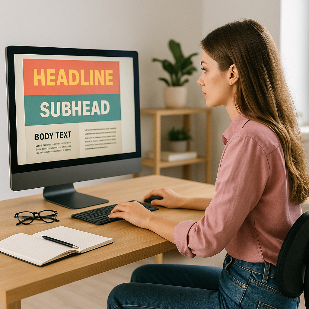
Not everything needs to fight for attention at once. I realized that adding layers to the hierarchy (primary, secondary, and tertiary) helps each element stand out at the right moment. For example, on a landing page, I used large text for the headline (primary), followed by a smaller subheading (secondary), and then the body text (tertiary). Each layer had its own space, allowing the user to focus on one thing at a time.
Common Mistakes (And How to Avoid Them)
Even now, I occasionally make mistakes, but I’ve learned from them. Here are some of the most common errors I’ve made—and how I fixed them:
- Making everything the same size: I used to make all elements the same size, thinking it would create harmony. But it just made everything blend together. I now use size and contrast to make the most important elements stand out.
- Using too many different fonts: In my earlier designs, I used all sorts of fonts. It looked chaotic. Now, I stick to one or two complementary fonts to keep things clean.
- Ignoring white space: This was my biggest mistake. Too much content in a small space feels overwhelming. I’ve learned that white space isn’t wasted—it’s part of the design.
- Changing styles in every section: I used to experiment with different design styles in different sections of a page. Now, I keep things consistent to ensure the user experience feels cohesive.
- Overdesigning the background: I once made the mistake of creating a flashy background that stole attention away from the content. I learned that simplicity is key.
Where Visual Hierarchy Shines
1. Web Design
I’ve seen websites double their conversion rate just by improving the visual hierarchy. Websites, landing pages, and e-commerce sites need a clear hierarchy to guide users and encourage action.
2. Print Media
Magazines and posters have been using hierarchy for years. The headlines grab attention, and the subtext guides the reader through the story. It’s visual storytelling at its finest.
3. Branding and Marketing
Brands like Apple or Tesla are masters of visual hierarchy. They know how to use size, spacing, and positioning to make their logos, products, and messages stand out.
Final Thoughts: Organize to Communicate Better
Design isn’t just about making things look pretty—it’s about communicating effectively. Visual hierarchy is the bridge between beauty and functionality. If you want to be a more effective designer, start thinking of your layouts as maps that guide a journey. And remember: once you know how to guide the eye, you can lead your audience anywhere.
From zero to design hero — keep creating!
by Cris.