
Choosing the right font is something that often gets overlooked, but let me tell you—it can make all the difference. I’ve been there, staring at a blank page, unsure if I should go for something bold and striking or maybe something subtle and elegant. The truth is, fonts are more than just letters; they carry meaning, they set the mood, and they reflect the message you’re trying to convey.
When I first started out, I made plenty of mistakes. I didn’t always understand how different fonts could affect the overall feel of my designs. Over time, I’ve learned some key principles that help me choose the perfect font for each project. So, I’ll share a bit of what’s worked for me, and I hope it can help you too.
🔹 Start by Understanding the Purpose of Your Project
Before you even think about fonts, you need to understand the purpose of your design. Is it formal or casual? Are you designing for a corporate website, a fun event poster, or maybe a portfolio? The purpose of your project will play a huge role in guiding your font choice.
When I started out, I didn’t always pay enough attention to this. But now, I know that choosing a font that aligns with your project’s purpose is key. For example, for more formal designs, I tend to go for serif fonts because they exude professionalism and reliability. On the other hand, if I’m designing for a creative, laid-back brand, I might choose a clean sans-serif or even a quirky display font to reflect that playful vibe.
The overall tone of the design will dictate which fonts work best. A whimsical, creative project calls for fonts with personality, while a more traditional or corporate design will require something elegant and straightforward. Knowing the purpose behind your design will help you narrow down your font choices and prevent you from going down the wrong path.
🔸 Think About Your Audience
Understanding your audience is crucial in choosing the right font. Is your design meant for a younger, trendier crowd, or is it targeting a more traditional, professional audience? I often remind myself that the font should speak to the people who will interact with it. A modern, bold font might work great for a design aimed at a younger audience, but it could be off-putting for a more conservative demographic.
For instance, I once worked on a project targeting young adults, and I used a font that was fresh and modern. It was playful, but not overwhelming. The response was fantastic, and I really felt the font helped me connect with that audience. So, always consider who will see your design and let that influence your font choices.
Fonts have the power to establish a connection with the viewer. The right font will resonate with the target audience and enhance the overall experience of the design. Whether it’s a fun, youthful vibe or a more formal, professional tone, the font you choose plays a huge part in making that connection.
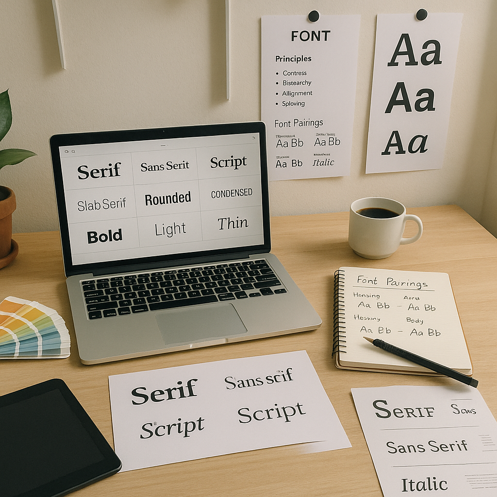
🔹 Understand the Different Font Categories
Once you’ve got a sense of the tone and audience, it’s time to dive into the categories of fonts. I used to get confused with all the options available, but now I understand the importance of choosing the right category. Different fonts evoke different feelings, and understanding the basics of font categories helps you make a more informed decision.
- Serif Fonts: These fonts have little lines at the ends of each letter. They tend to be more formal and traditional, which is why I often use them for print materials or high-end branding. Think of fonts like Times New Roman or Garamond. They’re reliable and give a sense of authority.
- Sans-Serif Fonts: These are clean, modern, and easy to read, especially for digital designs. Helvetica is my go-to here; it’s timeless, and I love how sleek and professional it looks. Sans-serif fonts are great for websites and modern brands that want a simple, approachable vibe.
- Display Fonts: If you’re designing something eye-catching, display fonts are a great choice. I use these for headlines or logos when I want to grab attention. Fonts like Lobster or Impact can make a bold statement, but I always try to use them sparingly to avoid overwhelming the viewer.
- Script Fonts: For projects that need a personal touch—like wedding invitations or unique logos—I love using script fonts. They feel elegant, but they also have a personal, handwritten feel. Fonts like Pacifico and Brush Script are great for that.
- Monospace Fonts: These are great if you’re designing something technical or retro. Monospace fonts like Courier New are perfect for coding projects or designs that need that typewriter vibe.
Each of these categories has its place, but understanding when to use each one will make your work stand out and communicate the right message.
🔸 Prioritize Readability and Legibility
A beautiful font is useless if it’s hard to read. Early in my career, I made the mistake of choosing fonts that were too decorative for body text. The designs looked nice, but no one could actually read them. Now, I always make sure that readability is my top priority.
For web designs, I aim for a font size between 16px and 18px for body text. And don’t forget about line spacing! It’s something I didn’t give much thought to in the past, but now I know that adequate line height makes a huge difference in how easy it is to read text.
- Contrast: Make sure there’s enough contrast between the text and the background, especially if you’re using light text on a dark background or vice versa.
- Font choice: Avoid using overly decorative fonts for long paragraphs of text. Stick with something simple and legible for readability.
A design is only effective if the viewer can easily read and understand the text. No matter how beautiful the font looks, readability should always be the priority.
🔹 Match the Font to the Brand’s Identity
When I’m working on branding projects, I always keep in mind the brand’s personality. A font is like a visual voice for the brand, so it needs to reflect what the brand stands for. If the brand is sophisticated, I lean towards a classic serif font. If it’s modern and cutting-edge, a clean sans-serif works wonders.
One of the things I’ve learned over time is that consistency is key. Using the same fonts across all brand materials—websites, social media, print—is essential for creating a unified identity. A consistent font choice tells your audience who you are and builds trust.
Consistency builds brand recognition. By using the same set of fonts across all materials, your brand becomes more easily identifiable, and your message becomes clearer and more reliable. It helps the audience connect with your brand on a deeper level.
🔸 Limit the Number of Fonts You Use
It’s easy to get carried away with different fonts, but I’ve learned that less is more. In my early designs, I used multiple fonts in a single project, thinking it would add variety, but it ended up making the design feel cluttered. Now, I limit myself to two or three fonts per project. I might pair a serif for headlines with a sans-serif for body text. The result is always much cleaner and more cohesive.
- Two or three fonts: I use a combination of a headline font, a body text font, and sometimes a decorative font for emphasis.
- Avoid too much variation: Stick to a cohesive style for your fonts, and avoid using too many different weights, styles, or sizes within one design.
By limiting the number of fonts you use, you allow the design to breathe and give it more focus and professionalism.
🔹 Experiment with Font Pairing
Font pairing is an art in itself. A good pairing can make your design dynamic, but a poor pairing can ruin it. Over the years, I’ve learned to balance contrasting styles, like combining a bold serif for headings with a light sans-serif for body text. It’s all about creating harmony between the fonts you choose.
If you’re ever unsure about a pairing, there are great online resources that suggest font combinations. Google Fonts, for example, has a pairing tool that makes it easier to test out different combinations and find the one that works best for your project.
Pairing fonts doesn’t have to be intimidating. The key is to balance complementary styles that work well together, and testing combinations can help you find the right fit.
🔸 Test Your Fonts in Context
Once you’ve chosen your font, don’t just leave it there. I always test fonts in the actual context of my design to see how they perform. Sometimes a font looks great in a design tool but doesn’t work well when viewed on different screens or backgrounds.
For example, I always make sure to test my fonts on both mobile and desktop devices. You’d be surprised how a font can change depending on the screen size or background color. Testing is essential to ensure your fonts are legible and look great no matter where they’re viewed.
🔷 Conclusion: Choose Fonts That Enhance Your Design
Choosing the right font is one of those skills that improves with time and practice. It’s all about understanding your project’s purpose, experimenting with different font categories, and testing how they look in real-world settings. A font can make or break your design, but when you take the time to select the right one, it can elevate your work and communicate your message in a powerful way.
So, keep experimenting with fonts, trust your instincts, and remember: the right font is out there waiting to make your design shine.
From zero to design hero — keep creating!