
When I first started designing, I underestimated the power of color. I thought it was all about choosing what “looked nice” or what was trending. But as I grew in my design journey, I realized that color is far more than just a decorative element. It’s a tool that can stir emotions, drive actions, and connect with your audience on a deeper level. Understanding how color influences emotion is a game changer — it’s what takes your designs from “okay” to unforgettable.
What is color psychology?
At its core, color psychology is the study of how colors influence human behavior and emotions. It’s the science behind why we feel energized by yellow, calm by blue, or motivated by red. When I first discovered this concept, it was like a lightbulb went off in my head. Suddenly, every design decision I made had a deeper meaning.
Colors are not just about aesthetics; they’re about creating an emotional response. For example, red is often associated with excitement or urgency, which is why you see it used in call-to-action buttons. Blue conveys trust and calm, making it a favorite in corporate and healthcare designs. Yellow brings energy and optimism, but you have to be careful not to overdo it, as it can cause visual fatigue.
As I started applying color psychology more intentionally, I noticed my designs became not only more engaging but more aligned with the brand message I was trying to communicate.
Why it matters in design
Good design isn’t just about looking pretty — it’s about communicating a message. Every color choice you make sends a subtle signal to your audience, guiding their emotions and responses. I’ve learned that color is one of the most powerful tools in a designer’s toolkit because it has the ability to shape the way people feel about a brand or product.
Here’s why color matters:
- Brand identity: Colors help shape how people perceive your brand. Take Coca-Cola with its iconic red—whenever I see it, I instantly think of excitement, happiness, and energy. That’s the magic of color.
- Emotional connection: The right colors can make your audience feel relaxed, inspired, or excited. For instance, when I was working on a wellness brand, I chose calming greens and soft blues to create a sense of peace and tranquility.
- User experience: Color affects readability, navigation, and accessibility. One thing I learned the hard way is that contrast is key. I once had a design where the text didn’t stand out enough against the background, and it created a frustrating user experience. Now, I always ensure my colors are both beautiful and functional.
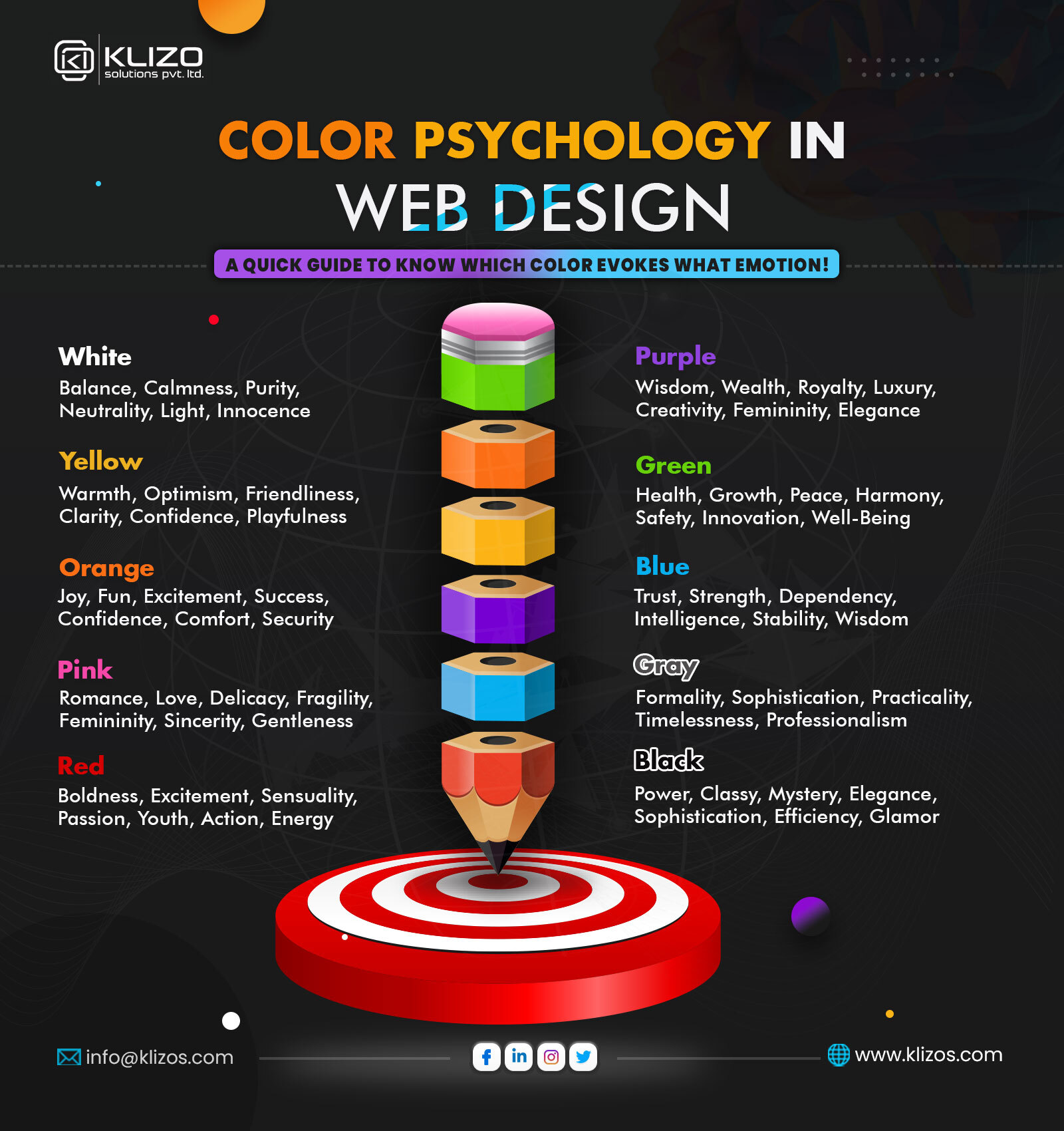
Understanding the meaning behind colors
To harness color psychology effectively, it’s crucial to understand the meanings behind common colors. These associations aren’t random — they’re deeply rooted in cultural and psychological patterns.
- Red: Bold, passionate, and urgent. Great for call-to-actions or limited-time offers. I often use red in designs where I want to grab attention immediately.
- Blue: Trust, calm, and professionalism. Perfect for corporate brands and healthcare. I remember using blue for a healthcare client, and it helped establish a sense of trustworthiness right away.
- Green: Balance, nature, and health. Ideal for eco-friendly and wellness brands. When I was designing for a sustainable brand, green was the natural choice to symbolize growth and harmony.
- Yellow: Creativity, joy, and attention. Use sparingly to avoid visual fatigue. Yellow works wonders when you want to create an upbeat and happy feeling, but I always use it as an accent color to keep things balanced.
- Black: Luxury, sophistication, or authority. Powerful in fashion and tech. I used black for a high-end fashion brand, and it immediately elevated the design with a sense of luxury.
- White: Cleanliness, purity, and simplicity. Strong base color for minimalistic design. I’ve always gravitated toward white for minimalist designs because it helps create an uncluttered, fresh look.
- Purple: Creativity, imagination, and luxury. Often used in beauty and spiritual products. I remember using purple for a beauty brand, and it gave the design an elegant and creative touch.
Step 1: define your brand’s personality
Before picking a color palette, take a step back and ask yourself, “Who is my brand?” This is something I often didn’t do early on, and as a result, I sometimes ended up with color schemes that didn’t feel right for the brand’s personality.
What emotions do you want your audience to feel? Are you formal, playful, innovative, or grounded? Understanding this is key. Once I started thinking about my brand’s personality and how I wanted my audience to feel, choosing the right colors became so much easier.
Example: A children’s brand might use bright yellows and reds to evoke energy and excitement, while a luxury spa might lean toward soft neutrals and pale greens for a calming, peaceful atmosphere.
Step 2: select primary colors with purpose
Choosing one or two main colors that align with your brand’s identity is crucial. These primary colors will serve as the visual anchors in your design system. Early on, I used to get carried away with picking too many colors, but now I focus on having a solid base of 1–2 primary colors that truly represent the brand.
Pro tip: I’ve learned to use color harmony techniques to create balanced, appealing designs:
- Complementary: Colors opposite each other (e.g., blue and orange) for high contrast.
- Analogous: Neighboring hues (e.g., blue, blue-green, green) for soothing designs.
- Triadic: Three evenly spaced colors (e.g., red, yellow, blue) for vibrant balance.
Step 3: adapt for context and culture
Colors don’t mean the same thing everywhere. One of the biggest lessons I’ve learned is to be mindful of cultural differences in color interpretation. For example, in Western cultures, white is associated with purity and weddings, but in some Eastern cultures, it’s linked to mourning. Similarly, red is a symbol of love and urgency in the U.S., but it’s considered lucky in China.
It’s also important to test how your colors look in different contexts — digital versus print, light versus dark modes. Colors can shift due to screen or material differences, and you want to make sure your palette works across all platforms.
Step 4: create a full color system
Don’t stop at primary colors — build a functional palette:
- Primary: Your brand’s main colors.
- Secondary: Supportive colors for contrast.
- Accent: Pops of brightness for buttons, highlights, or alerts.
- Neutrals: Greys, whites, and beiges to create visual rest and spacing.
Bonus tip: I’ve also found that pastels are incredibly popular for brands in the wellness and beauty industries because of their soft, calming effect.
Step 5: test your palette in real use
Before launching a design, it’s essential to test your color palette in real scenarios. Is the text readable? Do the colors work well in light and dark modes? I always ask 5–10 people for their feedback, especially on how they feel when they look at the design. Emotional clarity is key to a successful design.
Avoid these common color mistakes
Here are some mistakes I’ve made in the past and learned to avoid:
- Using too many bright colors: It creates chaos and makes the design hard to read.
- Relying on color alone for communication: Remember to consider accessibility for color-blind users and ensure good contrast.
- Ignoring cultural color meanings: Colors have different meanings around the world, so always be mindful of this when designing for international audiences.
Final thoughts: make your colors work harder
Color is silent, but it speaks volumes. When used intentionally, color can:
- Set the emotional tone for your design.
- Define your brand personality.
- Guide user behavior and decisions.
So, the next time you choose a color for your design, don’t just go with what “looks nice.” Think about the emotional response you want to evoke. After all, design isn’t just seen—it’s felt.
Let your colors do the talking.
From zero to design hero — keep creating!
by Cris.