
Color is one of the most powerful tools we have as designers. I remember when I first started out in design, choosing the right colors felt like a challenge. I didn’t know where to begin, and sometimes I’d end up with a palette that just didn’t work. Over time, I learned how to use colors more effectively, and now, I want to share what I’ve learned. If you’re a beginner designer like I was, understanding color theory and how to choose the right color palette can completely transform your work.
🔹 Why Color Matters in Design
Colors aren’t just about making something look pretty—they have a huge impact on how people perceive and feel about your design. The right color palette can make your design feel welcoming, professional, energetic, or calming. As I discovered, color can influence emotions, guide decisions, and even make or break the effectiveness of a design.
For example:
- Red can convey excitement, urgency, or passion.
- Blue is often associated with calmness, trust, and professionalism.
- Yellow can evoke feelings of happiness and energy.
Choosing the right colors helps communicate the message of your design and create a stronger connection with your audience. The trick is understanding color psychology and applying it thoughtfully.
🔸 Understanding the Basics of Color Theory
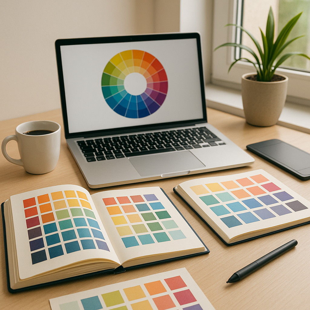
Color theory is the foundation of creating a cohesive color palette, and trust me, it’s worth taking the time to understand. The color wheel is a great tool for learning about how colors interact. I spent a lot of time studying it, and it really helped me gain confidence in my color choices.
The basic color wheel consists of:
- Primary Colors: Red, Blue, and Yellow. These can’t be created by mixing other colors.
- Secondary Colors: Green, Orange, and Purple. These are created by mixing two primary colors.
- Tertiary Colors: Colors like blue-green or red-orange, created by mixing a primary color with a secondary one.
Understanding these relationships helps you create balanced and harmonious palettes. This foundation was essential when I started creating more intentional designs.
🔹 The Color Wheel: How to Use It for Your Designs
Once you understand the basics, the color wheel becomes your best friend. It’s the easiest way to find colors that work well together and create a balanced design.
Here’s how I use the color wheel to choose my colors:
- Complementary Colors: Colors that are opposite each other on the wheel (like red and green). These create contrast and make each other pop.
- Analogous Colors: Colors that sit next to each other on the wheel (like blue, blue-green, and green). These colors are naturally harmonious and look great together.
- Triadic Colors: Three colors that are evenly spaced on the wheel (like red, yellow, and blue). This creates a vibrant, balanced look.
Using the color wheel as a guide helps me create palettes that feel natural and well-thought-out. It’s been a game changer for me as a beginner.
🔸 Types of Color Schemes You Should Know
Once I got comfortable with the color wheel, I started experimenting with different color schemes. These schemes give your design structure and cohesiveness. I’ve used each of these schemes in my projects, and each one offers something different.
Here are the most common color schemes:
- Monochromatic: This scheme uses different shades of the same color (like various tones of blue). It’s simple and calming.
- Complementary: Two opposite colors (like blue and orange) create contrast and visual interest.
- Split-Complementary: This variation uses one base color and two adjacent colors (like blue, yellow-orange, and red-orange).
- Analogous: Colors next to each other on the wheel (like yellow, yellow-green, and green) create a smooth transition.
- Triadic: A balanced palette using three equally spaced colors (like red, blue, and yellow).
These schemes can help you choose colors that fit the tone and mood of your design.
🔹 Choosing a Color Palette for Your Project
One of the most important lessons I learned was that every design project has its own unique color needs. A good color palette reflects the purpose of your design, appeals to your audience, and sets the right emotional tone. I used to struggle with choosing colors that fit my project, but once I understood the following principles, it became much easier.
Here’s how to choose a color palette:
- Consider the Mood: What feeling do you want to evoke? For a fun, creative brand, vibrant colors might work best. For a corporate website, more muted and professional tones might be ideal.
- Know Your Audience: Different demographics respond to different colors. I realized that understanding my target audience helped me select colors that appealed to them.
- Limit the Number of Colors: Less is more. I found that a palette of 2-5 colors is usually enough to create a cohesive look. Too many colors can overwhelm the design.
Tools like Adobe Color and Coolors are great for experimenting with color combinations and finding a palette that works for your design.
🔸 Tools to Create and Explore Color Palettes
Choosing colors for your design has never been easier, thanks to online tools. I’ve used many of them to generate and refine my color palettes, and they’ve saved me so much time.
Some tools I recommend:
- Adobe Color: This tool allows you to explore different color schemes and generate palettes based on your preferences.
- Coolors: A simple, intuitive palette generator that helps you create and adjust color palettes with ease.
- Paletton: A color scheme designer with real-time color selection and previewing.
- Colormind: This AI-powered tool creates palettes based on current design trends and inspiration.
These tools help you experiment with colors and find the perfect combination for your design, even if you’re just starting out.
🔹 The Importance of Contrast and Accessibility
As a beginner, I didn’t always consider contrast and accessibility, but I soon learned that it’s essential for readability. If the contrast between text and background is too low, it can strain the eyes and make your design hard to read. Ensuring good contrast is key for creating an accessible design.
I also started thinking about color blindness and tested my color choices using tools like Color Safe and Coblis to ensure my designs were accessible to everyone. A good rule of thumb is to aim for a contrast ratio of at least 4.5:1 between text and background.
🔸 Color in Branding: Creating a Strong Visual Identity
Colors play a crucial role in branding. They help establish a brand’s personality and influence how customers perceive the company. I quickly realized how important it is to choose the right colors for branding. For instance, Coca-Cola’s red conveys energy, while Starbucks’ green evokes freshness and calm.
When choosing colors for branding, I always consider the emotional impact and think about how the colors will look across different platforms (like websites, social media, and print).
🔹 Common Color Mistakes and How to Avoid Them
Even after years of experience, I still make mistakes with color sometimes. Here are a few common color mistakes I’ve learned to avoid:
- Overusing Bright Colors: Bright colors are bold, but too many can overwhelm the viewer. I’ve learned to use them sparingly for emphasis.
- Ignoring Accessibility: Not considering contrast and accessibility can leave a portion of your audience out. Always check your designs for accessibility.
- Not Testing the Palette: I test my color palette on different devices and in different settings to make sure it works everywhere.
By avoiding these mistakes, I ensure that my color choices are effective and enhance the design rather than detract from it.
🔷 Conclusion
Mastering color palettes is essential for any designer, whether you’re a beginner or experienced. Understanding color theory, choosing the right color scheme, and using the appropriate tools can help you create designs that are visually appealing and communicate your message effectively. Over time, you’ll get better at choosing colors that resonate with your audience and elevate your designs. Keep practicing, experimenting, and refining your color skills, and you’ll soon be selecting the perfect palettes with confidence.
From zero to design hero — keep creating!
By Cris