
When I first started out as a designer, I often found myself overwhelmed with all the visual elements I had to manage. From text to images, colors to spacing—everything seemed like a balancing act. But as I dove deeper into design, I realized that mastering visual composition is what makes all the difference. It’s not just about making something “look good”; it’s about creating a design that communicates effectively, captures attention, and feels harmonious.
Whether you’re designing a website, a social media post, or a product package, strong composition will set your work apart. Today, I’ll share how I improved my own visual composition skills and the tips that helped me along the way. I’ll also give you a few examples from my own projects, so you can see how these principles apply in real life.
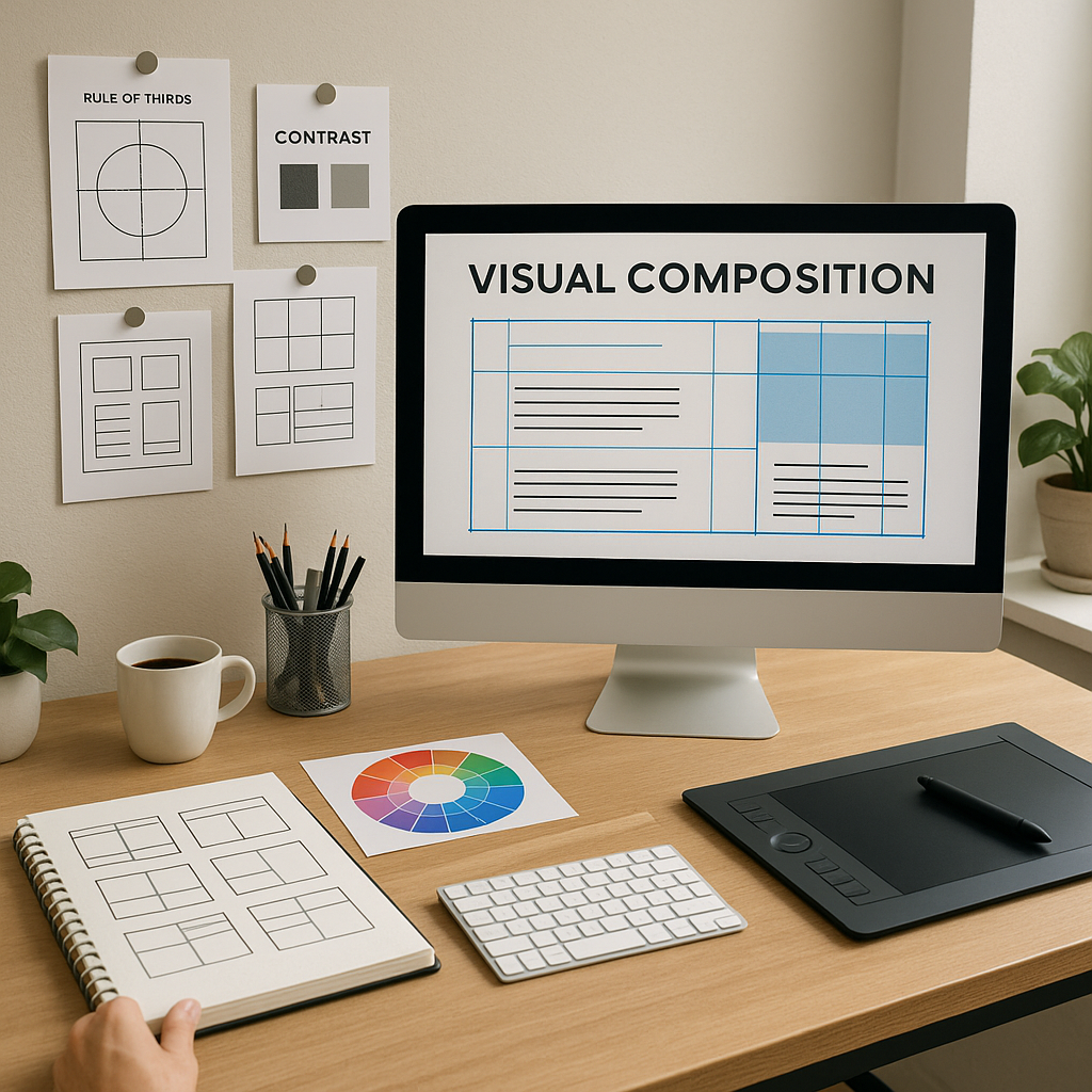
Understanding the Basics of Composition
The first step to improving your composition is understanding what it actually is. In its simplest form, visual composition is the arrangement of elements—text, images, shapes, and empty spaces—on a page or screen. It’s about balancing these elements so that they work together to communicate a message.
When I first started designing, I didn’t realize how important this was. I’d throw elements onto the screen and hope for the best. Over time, I learned that balance, hierarchy, alignment, contrast, and space are the core principles that make up strong composition.
- Balance is about distributing visual weight evenly across your design. Too much heavy stuff on one side can make the design feel “off.”
- Hierarchy is the order in which viewers process information. You want the most important things to catch their eye first.
- Alignment is about lining up your elements in a way that feels structured and organized.
- Contrast helps certain elements stand out, making them more noticeable.
- Space, or negative space, is the empty area around elements. This helps reduce clutter and adds clarity.
Take, for example, a magazine spread. The balance between text, images, and white space ensures that the page feels neither too crowded nor too sparse. When you get the balance right, your viewer’s eye moves naturally across the design, and it doesn’t feel overwhelming.
Using Grids and Alignment to Organize Layouts
One of the best tools I discovered early on is the grid system. At first, grids felt like a constraint, but I soon realized that they actually help bring everything together in a more cohesive way. Using a grid makes your layout feel more organized and aligned, which ultimately leads to a better user experience.
Here’s how I use grids in my designs:
- I enable grid lines in my design software—whether it’s Illustrator, Photoshop, or even Canva.
- I use a 12-column grid for responsive web designs, which helps me align things consistently across different devices.
- I make sure to maintain margins and padding between elements so that things don’t feel too cramped.
- I align text, images, and buttons to the grid for clean lines and a well-structured design.
When I was working on a website layout, using a grid system made it so much easier to ensure everything was aligned perfectly. Text, images, and buttons all had their own space, and the design felt clean and harmonious.
Creating a Clear Visual Hierarchy
The next thing I had to figure out was how to guide the viewer’s attention. I quickly realized that I could use visual hierarchy to control where people look first, second, and so on. This principle is about making sure the most important information stands out and is seen first.
Here’s how I do it:
- Size and scale: Larger elements tend to grab attention first. If you want people to notice something, make it bigger.
- Color and contrast: Use different colors to draw attention to specific elements.
- Position: The top-left or center of the design often gets more attention, so I place key elements in those areas.
- Type styles: Bold headlines, subheadings, and body text all help organize the content and make it easier to digest.
For example, when designing a landing page, the headline always comes first. I make it big, bold, and easy to read, followed by the subheading, which provides more context. The body text is there to support the main message but doesn’t steal focus.
Embracing White Space
At first, I was a bit afraid of white space. I thought that empty space would make the design look unfinished. But over time, I realized that white space is a designer’s best friend. It makes a design feel modern and professional, and it helps emphasize the elements that really matter.
Here’s why I now embrace white space:
- It improves readability and makes the design easier to scan.
- It emphasizes important content by isolating it, making it stand out more.
- It helps make the design feel clean and organized instead of cluttered.
For example, when I worked on a product packaging design, I made sure to leave plenty of white space around the product image. This gave the product breathing room and made it stand out more, without overwhelming the viewer.
Consistency is Key
Another mistake I made early on was mixing different styles of fonts, colors, and icons. I didn’t realize that consistency is essential to a strong design. When everything follows the same style, the design feels unified, polished, and professional.
Here’s how I keep things consistent:
- I stick to a color palette and use the same fonts throughout the design.
- I use consistent spacing and margins to maintain structure.
- I ensure that icons and imagery are all in the same style—no mixing flat icons with 3D illustrations.
For example, in a mobile app design, I used consistent button shapes, colors, and fonts throughout the app. This made the app feel like a cohesive experience and gave it a professional touch.
The Rule of Thirds
I came across the Rule of Thirds when I was learning photography, but I quickly realized that it applies to design too. By dividing your design into a 3×3 grid, you can create a natural visual flow that’s more dynamic.
Here’s how I use it:
- I position key elements along the lines or at the intersections of the grid.
- I avoid placing everything directly in the center, which can feel static and uninteresting.
For example, when I designed a product advertisement, I placed the main product at one of the intersections. This made the design more engaging and led the viewer’s eye naturally across the page.
Using Contrast to Create Emphasis
One of the easiest ways to make something stand out is by using contrast. Without it, everything in your design will blend together, and no single element will stand out.
Here’s how I use contrast in my designs:
- Color: I often use light text on a dark background (or vice versa) to create emphasis.
- Size: I make sure that titles are significantly larger than body text, so they stand out.
- Weight: I use bold and light versions of fonts to create variety and draw attention to key areas.
For example, when working on a brochure, I used a dark background with white text for the headline. This created immediate contrast, making the headline grab attention. The call-to-action button was also designed with contrasting colors to draw even more attention.
Grouping Related Elements Together
One principle that really helped me organize my designs is grouping related elements together. When elements are placed close to each other, the viewer assumes they are related.
Here’s how I apply this:
- I group related information into visual blocks.
- I keep unrelated elements spaced apart.
- I use consistent spacing between elements in a group.
For example, in a product website layout, I grouped related products together with consistent spacing. This made it easier for users to compare products and navigate the page.
Simplifying Your Designs
Finally, I learned that simplicity is often more powerful than complexity. Too many elements can make your design feel cluttered and distract from the message.
Here’s how I simplify my designs:
- I eliminate unnecessary elements.
- I limit my color palette and font choices.
- I use icons instead of long descriptions when possible.
For example, in a minimalist website design, I kept it simple with just an image, headline, and call-to-action. This made it clear what the user should do next without distracting them with too many options.
Testing and Getting Feedback
No design is perfect right away, and that’s okay. I’ve learned that testing and getting feedback from others is one of the best ways to improve. Whether it’s a peer, a mentor, or an online community, getting fresh eyes on your work can reveal areas for improvement.
Here’s how I get feedback:
- I ask friends or colleagues to review my work.
- I post my designs on platforms like Dribbble or Reddit for community feedback.
- I test designs on different devices to see how they look across screen sizes.
Conclusion: Mastering Composition for Better Design
Improving your visual composition skills isn’t something that happens overnight, but with consistent practice, it becomes second nature. By understanding the basics, using grids, creating a strong visual hierarchy, and embracing white space, you can create designs that not only look beautiful but also communicate effectively. So, keep practicing, learning from others, and refining your designs. Over time, you’ll develop an intuitive sense of composition that will elevate all of your projects.
From zero to design hero — keep creating!
by Cris.