
When I first started in design, I had no idea how important layout would be. I thought it was just about throwing elements together and hoping they looked good. But as I’ve worked on more projects, I realized that layout is the backbone of every design. A good layout guides the viewer’s eye, organizes content, and makes everything feel balanced. Today, I want to share some key principles that helped me improve my designs, and I hope they can help you too.
🔹 Why Layout Matters in Design
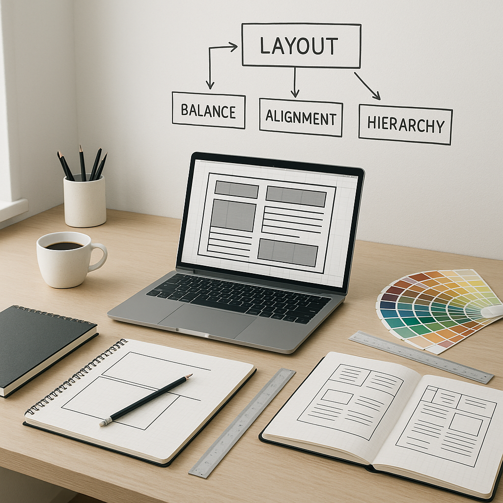
Good layout is the foundation of every successful design. It’s about how you arrange the text, images, and other elements on a page or screen. The layout helps you control how the viewer interacts with your design, guiding their eye from one point to another. As I began to understand this, I realized that a clear, structured layout makes all the difference between a chaotic, hard-to-read design and one that feels organized and easy to navigate.
A well-organized layout doesn’t just look good; it improves the overall user experience. It helps convey the message of the design effectively, whether you’re working on a website, a print piece, or a social media graphic. Good layout creates harmony between elements and ensures that everything serves a purpose.
🔸 Understanding the Grid System
The grid system is one of the first things I learned as a beginner. A grid might seem simple, but it provides a structure that keeps your design consistent and organized. It’s like setting invisible guidelines for where to place things, ensuring that everything aligns properly and doesn’t feel out of place.
To apply grids in your design:
- Use columns and rows: Divide your layout into columns and rows to help guide where each element should go.
- Margins and padding: Ensure elements have enough space around them to avoid clutter.
- Alignment: Always align your elements to the grid to maintain order.
Using grids made my designs feel more structured and visually appealing. It’s especially helpful if you’re just starting and need a framework to keep everything in balance. The grid system also helps you create designs that are flexible, making it easier to adapt to different screen sizes or formats.
🔹 Balance: Symmetry vs. Asymmetry
Balance is all about how you distribute visual weight across your design. When I was a beginner, I didn’t always understand this, and sometimes my designs felt “off.” I’ve since learned that there are two ways to balance elements: symmetry and asymmetry.
- Symmetry: This is when elements are mirrored on either side of a central axis. It creates a feeling of stability and order. I often use symmetry for formal, traditional designs.
- Asymmetry: On the other hand, asymmetry is a bit more dynamic. By arranging elements unevenly, you can create a modern, energetic feel. At first, I found asymmetry a bit tricky, but with practice, it became my go-to for more creative projects.
Understanding how to balance elements has helped me create designs that feel comfortable yet interesting. Asymmetry, for example, can add excitement, but it’s important to know when and how to use it without making the design feel chaotic.
🔸 Hierarchy: Guiding the Viewer’s Eye
Hierarchy is about showing the viewer what’s most important in your design. I remember when I first started, I struggled with how to lead the viewer’s eye through my work. But once I understood hierarchy, things clicked. It’s like having a roadmap for your design.
To establish hierarchy:
- Size and scale: Bigger elements draw more attention, so I make titles bigger than body text to ensure they stand out.
- Contrast: Creating contrast using colors or textures highlights key elements. It’s one of my favorite tricks for guiding the eye.
- Positioning: I place the most important information at the top or center of my designs, making sure it’s the first thing the viewer sees.
Hierarchy is about making sure your design has a clear order and message, and it’s key for helping your audience navigate your work. The best part is that hierarchy can also influence how people interact with your design, helping them easily find the information they need.
🔹 White Space: The Power of Negative Space
At first, I thought white space was just empty space, but I’ve come to realize it’s one of the most powerful tools in design. White space, or negative space, helps organize your design and gives it room to breathe. It makes everything feel less crowded and more balanced.
How I use white space:
- Avoid overcrowding: I leave enough space between elements to give my design room to “breathe.”
- Balance text and images: White space helps balance areas of text-heavy design with image-heavy sections, ensuring both elements feel proportional.
- Padding and margins: I use padding and margins thoughtfully to create a design that feels open and airy.
White space has transformed how I approach design. It keeps things clean and allows the important parts of my design to stand out. Without it, designs often feel cramped, and the viewer can easily become overwhelmed by too much information.
🔸 Consistency: Visual Unity Across the Design
When I was starting out, I made the mistake of using too many different fonts and colors in my designs. It ended up making everything look a bit chaotic. Once I understood the importance of consistency, my designs started to feel more cohesive and polished.
To achieve consistency:
- Use consistent fonts: I limit myself to two or three fonts and use them consistently for headings, body text, and buttons.
- Color palette: I stick to a set color palette to ensure everything feels unified.
- Spacing: I make sure the padding and margins between elements are consistent throughout the design.
Consistency is key to making your design feel professional and easy to navigate. By establishing a set of rules for yourself regarding fonts, colors, and spacing, you ensure that your designs will look more polished and cohesive.
🔹 Contrast: Making Important Elements Stand Out
Contrast is one of the most powerful ways to create emphasis in a design. When I first started designing, I didn’t fully appreciate the impact of contrast. Now, I use it to make key elements pop and create visual interest.
How I use contrast:
- Colors: I use contrasting colors (like light text on a dark background) to make important elements stand out.
- Sizes: I make headings bigger than body text to help establish hierarchy.
- Shapes: I mix different shapes—like circles and squares—to create a more dynamic look.
Contrast adds energy and emphasis to a design, making it more engaging for the viewer. It can also help guide the viewer’s eye, ensuring they focus on the most important parts of your design.
🔸 Alignment: Creating Order and Structure
Alignment might seem like a small detail, but it’s something I overlooked when I was a beginner. Proper alignment helps create order and structure in your design. It ensures everything is neatly positioned, which makes it easier for the viewer to process the information.
To apply alignment:
- Align text: I make sure my text is aligned properly—left, center, or right—depending on the design.
- Align images: I also align images with text and other elements to make everything feel organized.
- Grid systems: Using grids helps me align elements evenly, which keeps everything balanced.
Alignment gives my designs clarity and structure, making them more visually appealing. It also ensures that the viewer can easily follow the content and understand the message of the design.
🔷 Conclusion: Mastering Layout Design
Learning the fundamental principles of layout was one of the most valuable things I’ve done for my design career. By understanding and applying principles like grids, balance, hierarchy, white space, consistency, contrast, and alignment, I’ve been able to improve my designs and create more effective, visually appealing work.
As you practice these principles, you’ll find yourself becoming more confident and skilled as a designer. Keep experimenting, stay consistent, and don’t forget to have fun with it. The more you practice, the better you’ll get, and before you know it, you’ll be creating layouts that truly stand out.
From zero to design hero — keep creating!
by Cris.